Improving pathing + navigation
Cleaning our junk drawers and increasing engagement while we're at it
Role
Lead product designer
Platforms
iOS, Android
Timeline
April to June 2022
For the user
For the biz
Promote a premium feature and unblock innovation. We had just launched a new premium offering, but its impact — and our overall ability to innovate and scale — were constrained by the outdated app and fragmented information architecture.
And so what?
The new mobile information architecture increased deep studying by +9.7% and set up a foundation for future product development aligned with company priorities.
The problems
Pathing on the app fails to guide users to actual “studiable content” (flashcards, solution pages), which is where students get the most value from Quizlet, and how we make money.

Exploring two divergent directions
The first has Home / Search / Library as the bottom navigation items. It's fairly generic, but easily understandable and simple. The second has Home / Study Sets / Solutions / Search. This one is more unique to Quizlet as it puts our product verticals directly in the navigation. Both directions clean up the redundant pathing and have easy paths into studiable content.
Direction A: Home / Search / Library
(➕) It’s more scalable to new content types (i.e study guides, practice tests)
(➕) Aligns with how users are currently using the app.
(➖) It’s a generic navigation, it doesn’t feel “own-able” or unique to our product offering.

Direction B: Home / Study sets / Expert solutions / Search
(➕) More emphasis on premium product area
(➕) Aligns with the two biggest jobs we hear from students: sets & solutions
(➕) Very “own-able” by Quizlet
(➖) Not scalable: we will need to have conversations about where to put new product areas.

I tested both directions with users, where they were asked to complete certain tasks. While both generally performed well, it was interesting that in Direction B, even though we put "Study sets" in the navigation, students didn't have as much ease finding a previously studied sets as we hoped.

Finalizing the solution
Combining the best of both of directions:
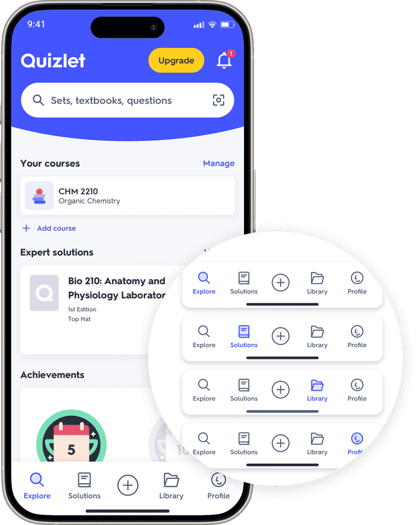
A different take on Home, rebranding it to Explore. The entry point to search is now on the home screen. We had some initial reservations about this, but this framing actually makes Search more prominent while giving the Home screen more purpose.
Keeps Library as the place for your content. This is a very recognizable name and mental model.
Keeps Solutions as a navigation item to give the premium product area more exposure.
Adds Profile, where the user's streaks and achievements will be stored along with settings.
Adds Create button because that drives the content flywheel


The "swoop" of the home screen header
The search field is at the top of the screen, wrapped in our brand color and a shape inspired by the Q in our wordmark. The swoop motif has potential to flex, whether it be seasonal moments on the home screen, premium-only headers, or other pages.


Iconography
We also explored options for iconography for the bottom bar, ultimately deciding on the more visually simple and utilitarian options. I created a subtle bounce-back animation as you tap on each icon.

Impact
+9.7%
in number of questions answered per user — our proxy for “deep studying”
This means that more students were finding the right “studiable content,” which was our main goal.
Our drawers are now thoughtfully organized—everything has a clear, intuitive place where users expect to find it. This work also laid a strong foundation for future iterations aligned with the company’s priorities. It established:
Home as a purposeful place to land and brings Search to the forefront
Solutions, our premium product, with elevated visibility prominence
Profile as the hub for badges and streaks, an area the company was investing in


